Brand identity for a brave new strategy
B2B · Textile Traceability · Supply Chain · Blockchain · Amsterdam

Working with Gaurav on AWARE™'s rebrand was one of the most valuable creative processes I've been through.
He came with a structured methodology for getting to the core of our identity, aesthetically and well as strategically, and had a real talent for translating that into visual ideas that felt right for where we were heading.
Maaike Orta, Marketing Manager, AWARE™
Designed brand identity and strategic assets for AWARE™ to reflect and reinforce the bold new strategic direction taken by the leadership.
Assets included brand book, decks and website for investors, consumer facing communication, and strategic sales presentations for government officials in China.
The textile industry runs on the power of massive brands, which dictate what the textile producers do and how. The leadership of AWARE™ decided it was time to flip this narrative. Their blockchain based textile traceability system would leverage technology to give the power back to producers in Asia.
However, their current brand and communication was geared towards textile brands - it had a techno-corporate feel. A deep blue color with muted, safe typography and impersonal, generic copy.
This identity didn’t match their new direction. They needed a bold new brand look.


The Before Version: The original brand language of AWARE™ focused on European consumers and brands
To come up with a new brand language, we used the [Seek, Shape, Scale] framework developed at PurpleDrop.
Seek - We first researched the employee opinions as well as the competing brands to deeply understand the state of affairs in the area.
Shape - Based on the study and discussions with the leadership team, we sketched out new directions for the brand and created a dedicated brand book capturing the key elements of the new brand.
Scale - We created multiple assets which adhered to the brand book, bringing the fresh vision to life.

Collecting intelligence: Employee survey responses grouped into themes
The employee survey questions explored the core of the Brand. We clustered them to let meanings emerge. This also helped us learn if the team was aligned on a single mission.


Leadership’s Insights: White-boarding the new Shape through a 3 hour Brand Sprint with the leadership
Once we had analyzed these, we presented all the ideas to the leadership team - to prime them to now build a new vision - which had a solid foundation in the current reality.
So the Shape phase began. We conducted a structured brand sprint, pulling out the core values, personality, mission and audiences of the brand.

Exploring the brand: Mapping out the Brand Personality (Daring, Innovative, Approachable) through visual mood boards
With the base solidified, we started work on going deeper into shaping the visual identity of the brand - anchored in the personality we had come up with.
This entailed deeply exploring the meaning of each dimension of the personality, and what it meant and looked like. And mapping that to the intended audiences.
Mission
The guiding light
This statement should reflect in our communication - from the website to investor pitch decks. This is our ‘opening line’ which sets the stage.
Build Trust in
Supply Chains
AWARETM Brand Guide 2025 · Version 1.0
AWARETM Brand Guide 2025 · Version 1.0
Scarlet
The Signature of the Brand
This vibrant hue is also known as ‘electric orange’ or ‘boiling magma’. It lies in a sweet spot between red and orange. The Red color shows our daring personality while the orange highlights the approachability.
#FF3300
AWARETM Brand Guide 2025 · Version 1.0
Configurations
Preserve contrasts
Text
Text
Text
Text
Alternate Snow and Earth, but only use Snow on Scarlet and vice versa. Never use Earth and Scarlet superimposed on each other.
Snapshots from Brand Book: A new mission statement, colors and guidelines

As explorations progressed, we got into the nitty gritties, exploring brand colors and typography - getting to choices we really liked, and which fit the new approach.
And we also articulated a fresh new mission statement, which captured the spirit of the brand, and was employed in marketing communications.

AWARETM Brand Guide 2025 · Version 1.0
Voice
Human, but not over-friendly
Be: Human, warm, simple, everyman, inclusive, personal
Don't be: Over-friendly, corporate, over-technical, sensational, gimmicky, unserious
We simplify technical language for humans.
But we also match the expertise our sophisticated audience members who can be PhDs and Business heads.
But even for them, we start with a human language, and then gently introduce technical details.
Examples:
Great: Show the story of your materials - from source to shop (human)
Good: Show the details of your materials with a Digital Product Passport (slightly technical)
Bad: The details of your materials can be provided with a DPP (corporate, passive, abbreviated)
Brand Voice Snapshot: Clear explanations with examples

The brand continued to take shape as we finalized decisions on these elements as well as on the voice and tone of the brand.
This set us up for the Scale phase where the concepts meet the real world.
Product data that starts at the source
Digital Product Passports and Compliance reports are only as strong as the data feeding them. With AWARE™, you capture data at the source, delivering accuracy and trust.
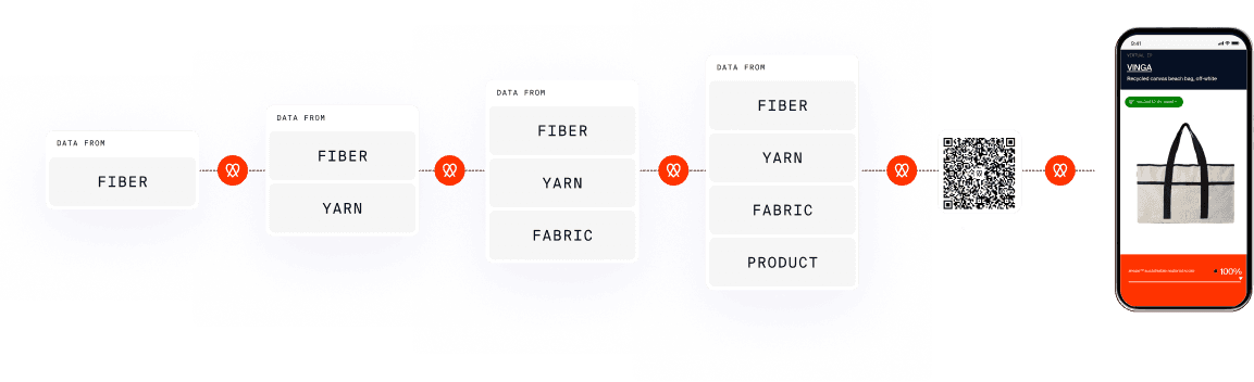
From the Website: Showing the core flow of materials and information
Crypto TC™
Sent
7030
AWR
From
0x99e7cfdbbaa65cdc086dc3a64d97e004db6158db
To
0x36FB3F6D43460293419BD58655f675f2FcE17FeF
Status
COMPLETE
Fees
488978 IOX
Sent at
11/04/2023
Reference ID
77597630
01 Reference number
77597630
02 Net weight (KG)
7030
03 SOURCE ADDRESS
Amex Knitting & Dyeing Ind Ltd PC5P+FJP, N1, Dhaka, Bangladesh Bangladesh
05 COUNTRY OF SOURCE
Bangladesh
06 COUNTRY OF DESTINATION
Netherlands
09 DECLARATION OF BODY ISSUING THE CERTIFICATE
The AWARE™ blockchain certificate verification system issues and verifies digital certificates (Crypto TC™) on a public blockchain to immutably record material exchanges within a value chain. Each transaction generates a unique ID and hash, broadcasting across the network for verification by multiple nodes. Subsequently, it becomes part of an unchangeable block, linked to the prior one through its hash, forming an unalterable chain of blocks. This ensures that this Crypto TC™ is an unalterable source of truth, vital for reporting and mass balance calculations of materials while offering an infallible audit trail to substantiate claims.
04 DESTINATION ADDRESS
XD Connects Lange Kleiweg 6-28 Netherlands
CRYPTO TRANSACTION CERTIFICATE (TC) FOR MATERIALS RECORDED ON THE AWARE TRACEABILITY PLATFORM
AWARE VERIFIED
This electronically generated document is the genuine and official version. Scan the QR code to confirm its integrity. To prevent potential hacking, ensure the QR code always leads to wearaware.co. If it links to any other site, the document is fake. AWARE™ and Crypto TC™ are registered trademarks by The Movement IP BV, The Netherlands.
Compliance without the complexity
Regulations keep changing, and buyers need proof they can rely on.
AWARE™ keeps your batch records and compliance reports up to date as expectations change, so you and your buyers stay ready for EU and US requirements, without rebuilding the same reporting for every request.
Talk to us
From the Website: The compliance reports generated on the blockchain
Stop wasting time on repetitive work
Most producers spend hours every month re-entering the same production data across buyer platforms and compliance reports. That’s not sustainable.
Register your batches once in AWARE™, and it becomes your central hub for material, production, and proof.
Talk to us
Home
Create
Aware™ Tokens
Export
Create Token
Wallet
Create
Update
Send
DATE
03 / 07 / 2025
03 / 07 / 2025
03 / 07 / 2025
03 / 07 / 2025
03 / 07 / 2025
TYPE
Yarn
Yarn
Yarn
Yarn
Yarn
COLOR
ASSET ID
Yarn - 16/1s - 100% cycora® Polyester - Natural - ambercycle123
Yarn - 16/1s - 100% cycora® Polyester - Natural - ambercycle123
Yarn - 16/1 - 100% Recycled Cotton (Post-Industrial) -Lilac
Yarn - 7s - 100% Regenerated Organic Certified® Cotton - Light Orange
Yarn - 16/s - 70% Conventional Cotton / 30% Conventional Polyester - Signal Red
WEIGHT KGS
100
10
100
500
400
STATUS
SENT
CONCEPT
SENT
CONCEPT
CONCEPT
From the Website: Copy and visual to address the core benefit of saving time

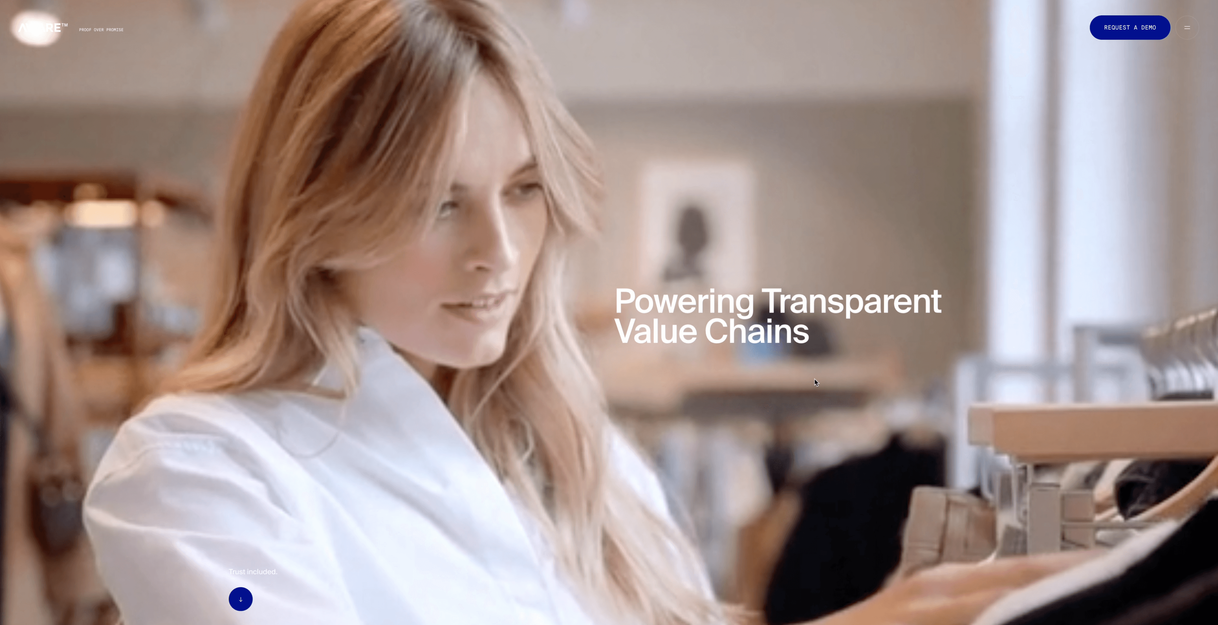
The new identity took a life across social media, and the company website.
The visuals were minimal yet clear while showing the courage to stand out with a bold scarlet color, in a sea of blue and green which is typical of technology and sustainability brands.
We also shaped the copy to feel punchy and direct, fitting the voice of the brand for customers.

Investor website: Hero section with VC-centric language and visuals
XD Design
4,850 kgs.
DPP
Iqoniq
850 kgs.
DPP
Waste
1,850 kgs.
Jiangsu Reborn
Yarn - 23445 - 150DTY - 100% Recycled Polyester - Natural
10,000 kgs.
Investor presentation: Slide showing material traceability from source to shop

We also used the new brand language to shape investor and senior stakeholder communications.
From an investor focused website highlighting the technological capabilities of the brand, to complex visuals for mature stakeholder presentations.

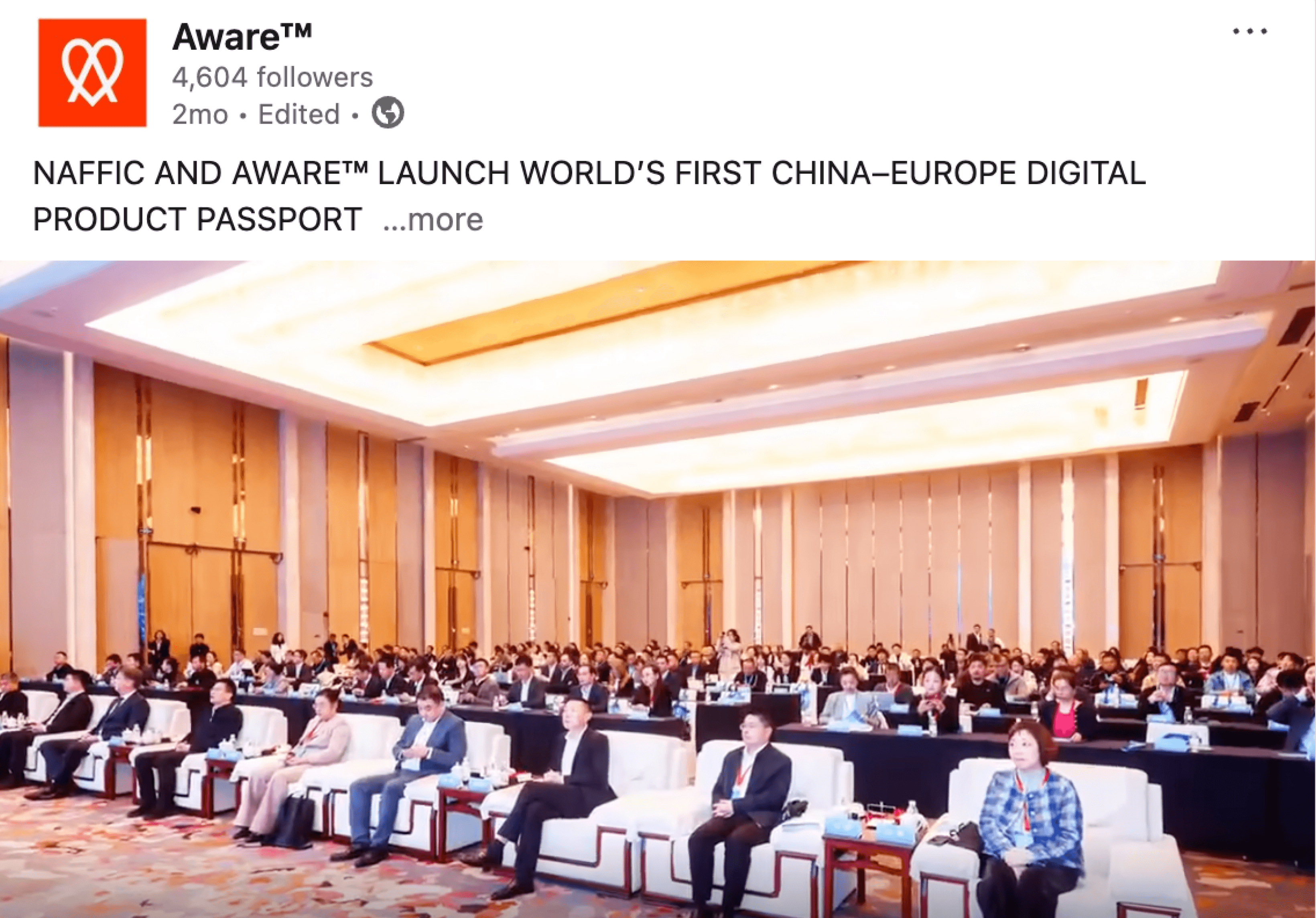
In the real world: Strategic presentation to senior stakeholders in China

The investor communication visuals played a role in the historic partnership between NAFFIC - a textile government agency in China, and AWARE™ as the European player.
Ready to take your business to the next level with a fresh brand identity?
Talk to us
PurpleDrop

PurpleDrop B.V.
Griendstraat 34· 1069 VB Amsterdam
The Netherlands
gaurav@purpledrop.nl